Public
ESTAL Glass Decoration
Estal Locations
Estal News
Estal product downloads
Estal Products
ESTAL Videos
If this is your company, CONTACT US to activate Packbase™ software to build your portal.


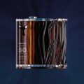
Track21 is a concept that revolves around a bottle which is always travelling and which, despite the difficulties along the way, always reaches its destination. It is a journey, a connecting point, a unique story that speaks of determination and resolution; a compelling project which brings forth an ideal of bravery and great strength.
This proud and resolute product emerged from the vision to implement a bold design which could portray this hard and arduous journey in a unique way, helping us recall the unmistakeable charm of travel or what it means to travel, and showing us that it is still possible to dream.
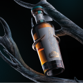
The Wildly Crafted BOBBER JR 50CL bottle awakens artisan nostalgia, but also a value for design and things done the right way; making it the perfect base for this ambitious project, nostalgic for easier years, and with a positive vision for the future.
NAMING
The choice of the name Track came from a desire to highlight the impressive journey taken by this beer, as well as a desire to define our own path. “Track” refers to the connecting path that we often have to take or traverse in countless moments of our lives and which is basically the link between the start and the end of the journey of life. The number 21 marks the beginning of 2021, designed to be the gateway to an exciting and daring future and to make it a unique opportunity to experience something incredible.
LOGO-LETTERING
For the “Track” logo-lettering, we created a unique lettering that could best express the concept behind the product. It has an elegant style, all in capital letters and slanted, with a high contrast and heavy weight, skilfully playing with the thickness of fine lines and thick lines which are reminiscent of railway typefaces.
For the “21”, we opted for a more lineal, tubular and non-contrasting typeface that would serve to emphasise and create coherence with the name’s meanings. Both have been produced and decorated with bronze foil using the stamping technique.
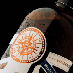
Furthermore, various techniques have been used to produce the label, combining UV printing, blind embossing, micro-embossing and polishing, in order to create a product with quality and value.
THE CONCEPT
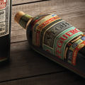
Numerous messages have also been added to the label, from the name and type of beer, to the coordinates of the brewery, and even inspirational thoughts and a description of the ingredients. Other graphic elements have also been added to the ensemble, such as the PAR AVION airmail stamp, the compass rose and the phrase “ENJOY YOUR JOURNEY”, to highlight once again the concept of travel and its beauty.
The intertwining strips that we see throughout the label, beyond connecting all the graphic and typographic features, give a glimpse of what could be the trajectories of many roads, paths across the sea or lines linking destinations.
An uncoated paper in camel tones has been used and predominantly decorated by the typography. The text, written in a Norman typeface (recently conceived), uses enchanting words to reveal what it really means to travel and the emotions one feels when doing so.
Each block has been designed and produced with lead lettering and placed by hand using special tongs, thus giving a very prominent final result. Everything is linked by the Norman typeface with the occasional addition of the Auster typeface, also created by Resistenza.
Thanks to the initiative of the Italian agency ABasileADV and Resistenza Type Foundry, we have been involved in the Track21 project to create a new concept for beer. We have combined our creativity in the world of packaging to create a unique and authentic beer concept.



.jpg)










.jpg)


