
Form follows function
This old principle of good design was followed to the letter by KPSS-Kao Professional when the company redesigned the packaging of its haircare line.
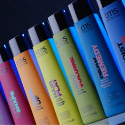
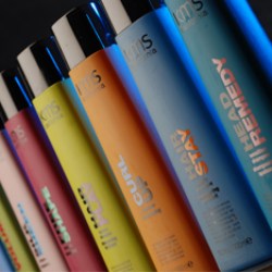
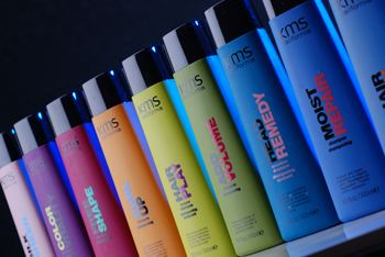
Innovative (and for this product segment, entirely new) soft-touch surfaces plus an improved cap are what characterise the KMS California product range for professional haircare. "Our new design reflects what we believe in and what inspires us: people's fascinating, colourful diversity and the different ways they express their individual style", says KPSS. Which is why the colour of the bottles is suitably varied and extremely intense - marked by strong berry and fruit tones.
The bottles for the individual salon products each have the same shape as their predecessors but are now slightly less curved. They can easily be distinguished thanks to clear colour coding. User error is ruled out here.
Quality is Trump
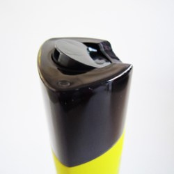
Weener's press-top cap contributes to the innovative look of the packaging: It is K2 moulded where two different materials are bonded together. Here an inner corpus is given a transparent coating achieving a similar thickness to the inner corpus itself. In terms of both visuals and touch this gives the packaging very high quality appeal. The bottles are very easy to handle and use. No product residue is left at the bottle opening and the packaging always closes securely. When the disc is activated a noticeable click can be heard as it reaches the OPEN/SHUT position. As part of the product relaunch the recess grip was incorporated again and widened for extra user friendliness.
Both project partners praise the excellent cooperation between Weener Project Management and Development and KPSS Design that brought about this chic and very user-friendly product.
Design Milestone
"Our packaging is more than just a bottle and a cap - it reflects the essence of our brand", says a self-confident KPSS with reference to its KMS California product line. The designers have given the trend label an innovative new look - sporting very modern and individual colouring that sets a milestone in packaging design. Obviously, this is particularly reflected in the modern look of the packaging as well as in its clear, straight-lined typography.
The aim here is to give the products a presentation that is as unique as the looks and styles created with them. With the new packaging for KMS California KPSS has created a design object that will, without question, promote the brand's image in the premium segment - and also inspire the creativity of its users. The current KMS California Range comprises 52 products identified by means of nine colour segments.


