If this is your company, CONTACT US to activate Packbase™ software to build your portal.


Changing the shape of your packaging can have a positive impact on your business. This is what food producer Kata Food has recently experienced. The family run and owned company is headquartered on the famous Italian island of Sicily, from where olives, preserves in oil and pickles, are shipped to quite a few European markets.
Moving from round to square
Previously a round pail was used for these products but then Kata Food found the time was ripe for taking a fresh look at the packaging. Fabrizio Salemi, Area Sales Manager (South East Asia and Middle East) , Kata Food S.r.l, explains:
“We wanted to change the shape of our packaging to something more attractive and practical. We are very pleased with the square shape and the convenient handles. The SuperCube bucket proved to be an excellent choice. It looks outstanding on shelf.”
Space optimisation
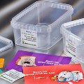
There are clear advantages linked to the square shape; first of all, it is space efficient. The packaging design allows for optimal use of space, meaning that there is no unexploited space on a pallet, and it is also an advantage for warehouse storage.
This goes for Kata Food as much as for its distributors and customers; they also benefit from the fact that the square containers are easy to stock. As a consequence, Kata Food now experiences superstores and hypermarkets ordering larger quantities, which also cuts fuel consumption for transportation.
Take a look at the creative and the content
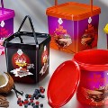
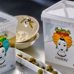
A meticulously reproduced drawing of an adorned lady’s head decorates the square buckets. The colours are eye catching, and even the most subtle shades are brilliantly reproduced on the bucket thanks to the advanced In-Mould Labelling technique from Berry Superfos.
Kata Food uses the SuperCube packaging solution in two sizes: 2.2 litres and 5.2 litres. A large see-through area on the upper third makes it easy for the consumer to take a look at the content while shopping. This is far from a coincidence, Fabrizio Salemi explains:
“Being able to see the content is very important to our customers. We know this from experience. It conveys trustworthiness and whets the appetite. It is a plus that the colours used for the drawing perfectly match the content. Today, our packaging is clearly different from the packaging of our competitors, which is very important in a competitive market like ours.”
Asia is next
He wraps it up with a positive remark about the partnership with Berry Superfos:
“We are happy with our collaboration with Berry Superfos. The team is always willing to help and always available. We look forward to continuing the journey – actually, Asian markets are next on our ‘bucket list’.






.jpg)








.jpg)



.jpg)
.jpg)
